Neurolign
Indsutry
Neurotech
Scope
Branding
Market
B2C
THE BRIEF
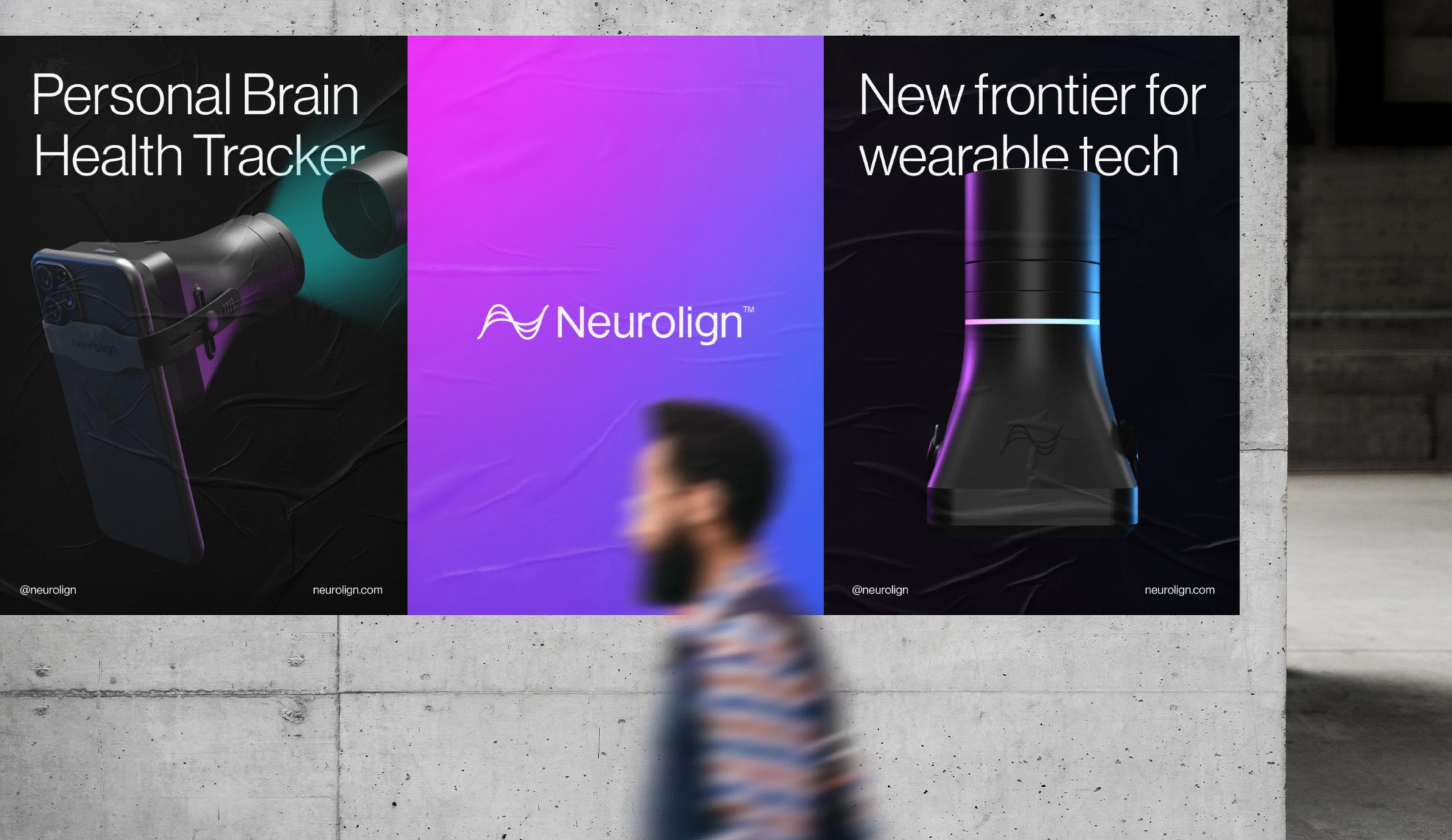
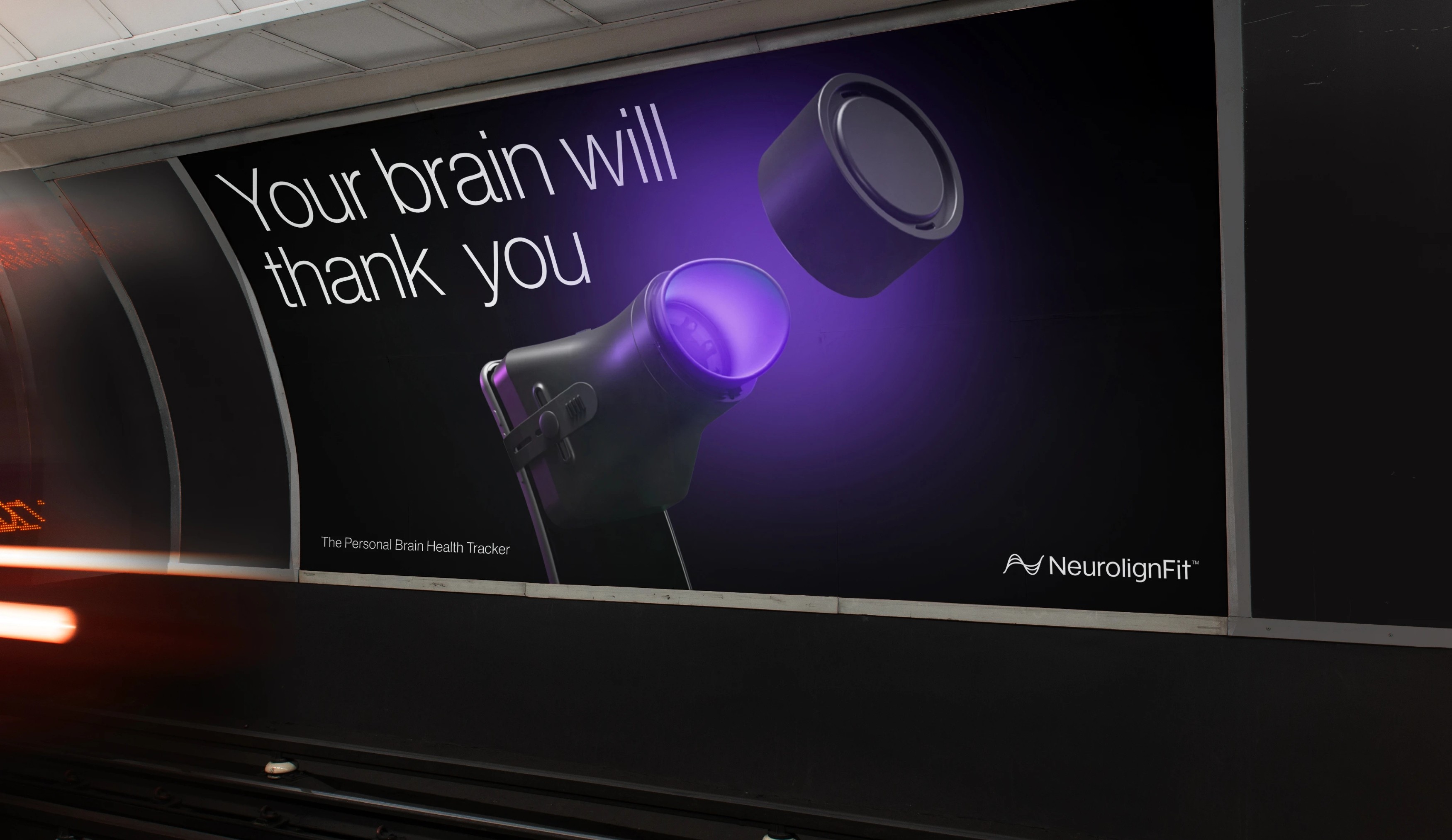
Neurolign had the science, the research, and the technology. What it needed was a brand capable of carrying all of that into a consumer market that had never encountered anything like it before. Aurra was brought in to transform the brand identity, purpose, story, and packaging, and to position Neurolign as the marketplace leader in a category it was creating.
THE CRAFT
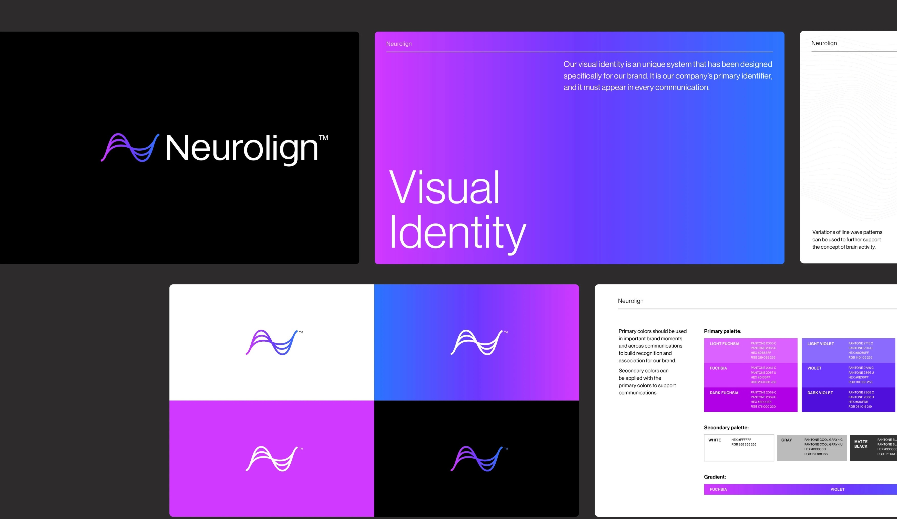
The brand strategy was built to do two things at once: honour the weight of 30 years of scientific credibility and make the product feel genuinely accessible to everyday consumers. The purpose and vision language, core values, and rallying idea were shaped to bridge that gap, giving Neurolign a clear point of view on why brain health matters and why now is the moment to act. The visual identity drew its inspiration directly from the science. Brain wave patterns observed through medical devices informed a symbol that combines fluid, wavy lines with the letter N, creating a mark that embodies the product's core function: monitoring cerebral activity. Gradient and wavy graphic elements extend this language throughout the system, capturing the dynamic nature of brain activity in motion. A clean, minimalist grotesque typeface grounds the identity, providing stability and balance to the movement within the design without losing its sense of modernity.
THE OUTCOME
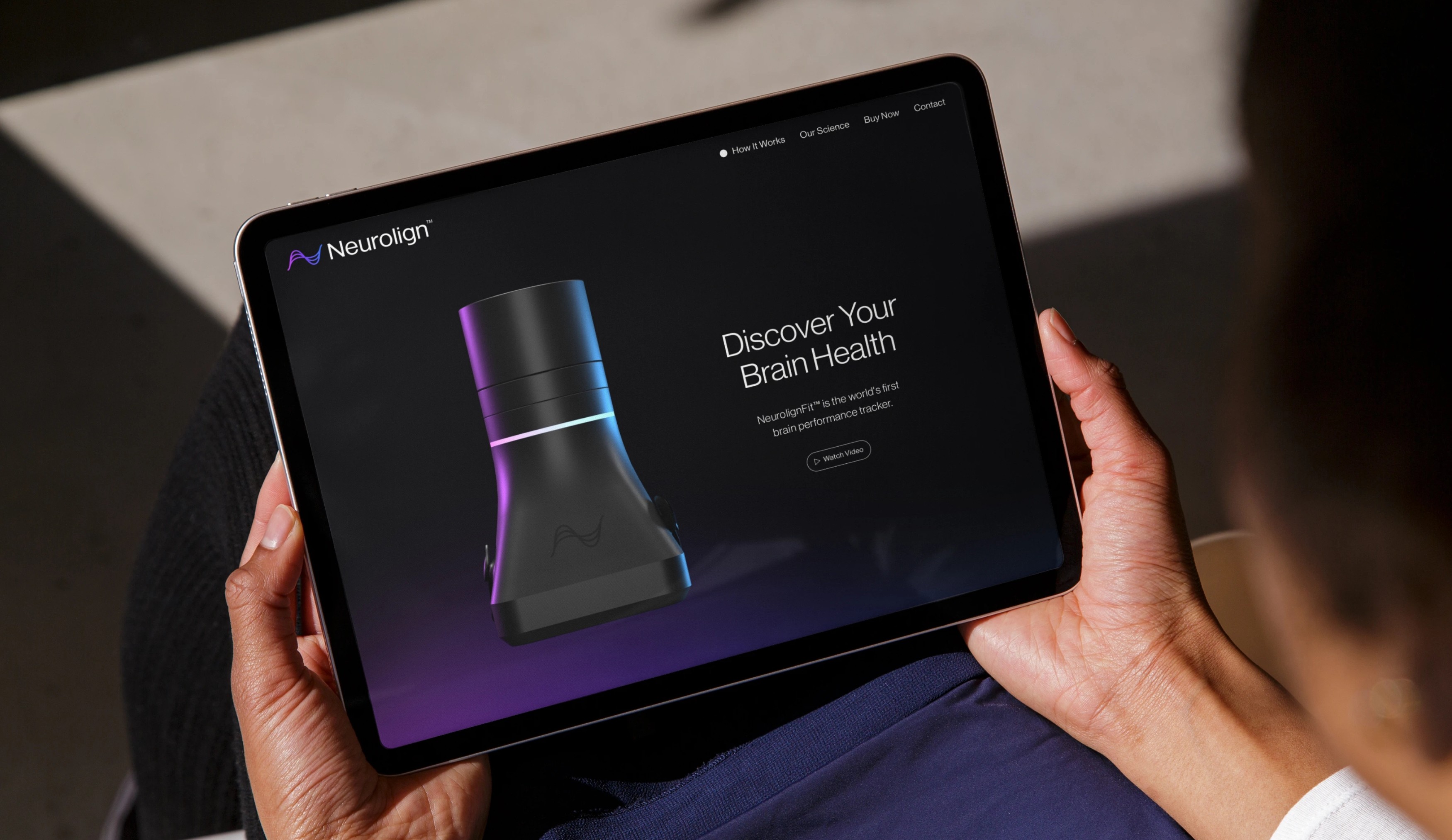
Since launch, Neurolign has been embraced by both patients and healthcare providers. NeurolignFit was launched, the I-Portal Device received FDA clearance with over 150 installations, and the brand has been featured in Neuroscience, Nature Medicine, and Biospace. By giving people real-time data on their own cognitive function, Neurolign has done something no consumer brand had done before: made brain health something people can take into their own hands.