Interpat
Indsutry
Pharma
Scope
Branding
Market
B2B

THE BRIEF
Interpat needed a visual identity that could carry the weight of its mission across a wide range of touchpoints, from annual reports and event materials to digital platforms and international forums. The identity had to feel credible to policymakers and scientific leaders while remaining clear and considered enough to open conversations beyond the industry.

THE CRAFT
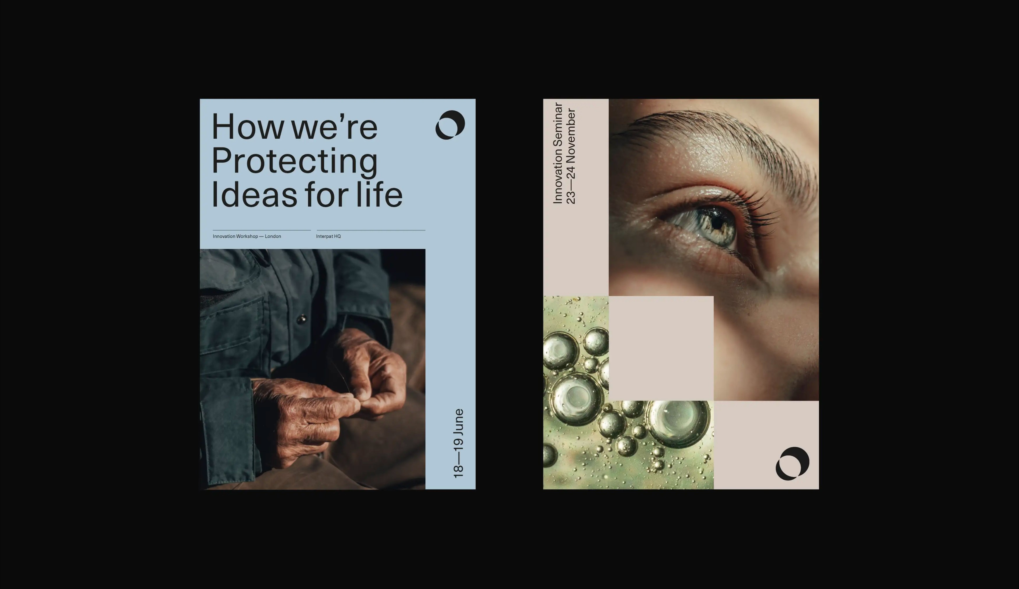
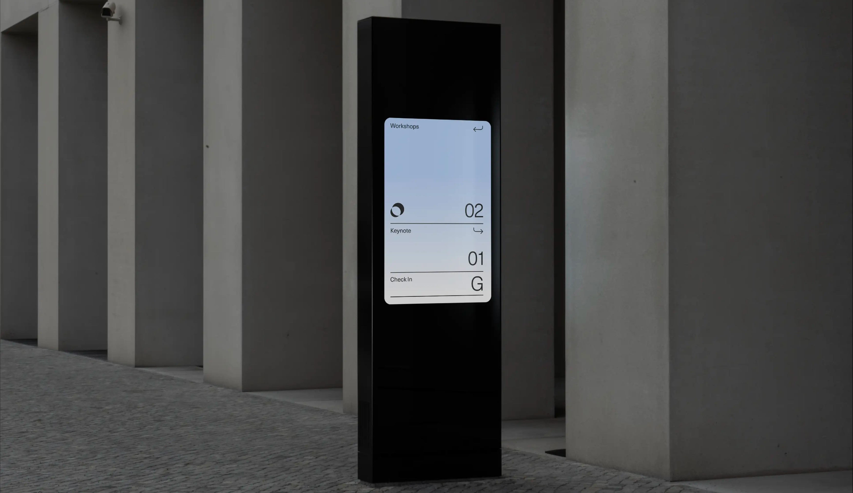
The identity was built around clarity and quiet authority. A clean, modern logo mark paired with precise sans-serif typography gives the brand a contemporary feel without losing its institutional credibility. The colour system moves between soft blue, warm neutral, and deep black, creating flexibility across both light and dark applications while maintaining a consistent tone throughout. Photography plays a central role in the visual language, close-up portraits, aged hands, microscopic detail, and sweeping landscapes, imagery that connects the abstract world of intellectual property to real human lives and real scientific stakes. Event materials, including innovation seminar posters, workshop collateral, and international forum assets, were designed with the same grid-led discipline, ensuring the brand holds its presence whether in a boardroom in London or a conference hall in Amsterdam. The website and digital experience bring the same rigour to screen, with a clean information architecture and editorial content framework built around Interpat's ongoing programme of stories, workshops, and keynotes.
THE OUTCOME
The refreshed identity gave Interpat a visual language that reflects the seriousness and significance of its work, while making that work more accessible to a broader audience. Across annual reports, digital platforms, and global events, the brand now speaks with a consistent and considered voice, one that is as comfortable addressing a sustainability breakthrough as it is an international policy forum.