Altero
Indsutry
Hospitality
Scope
Branding
Market
Global
THE BRIEF
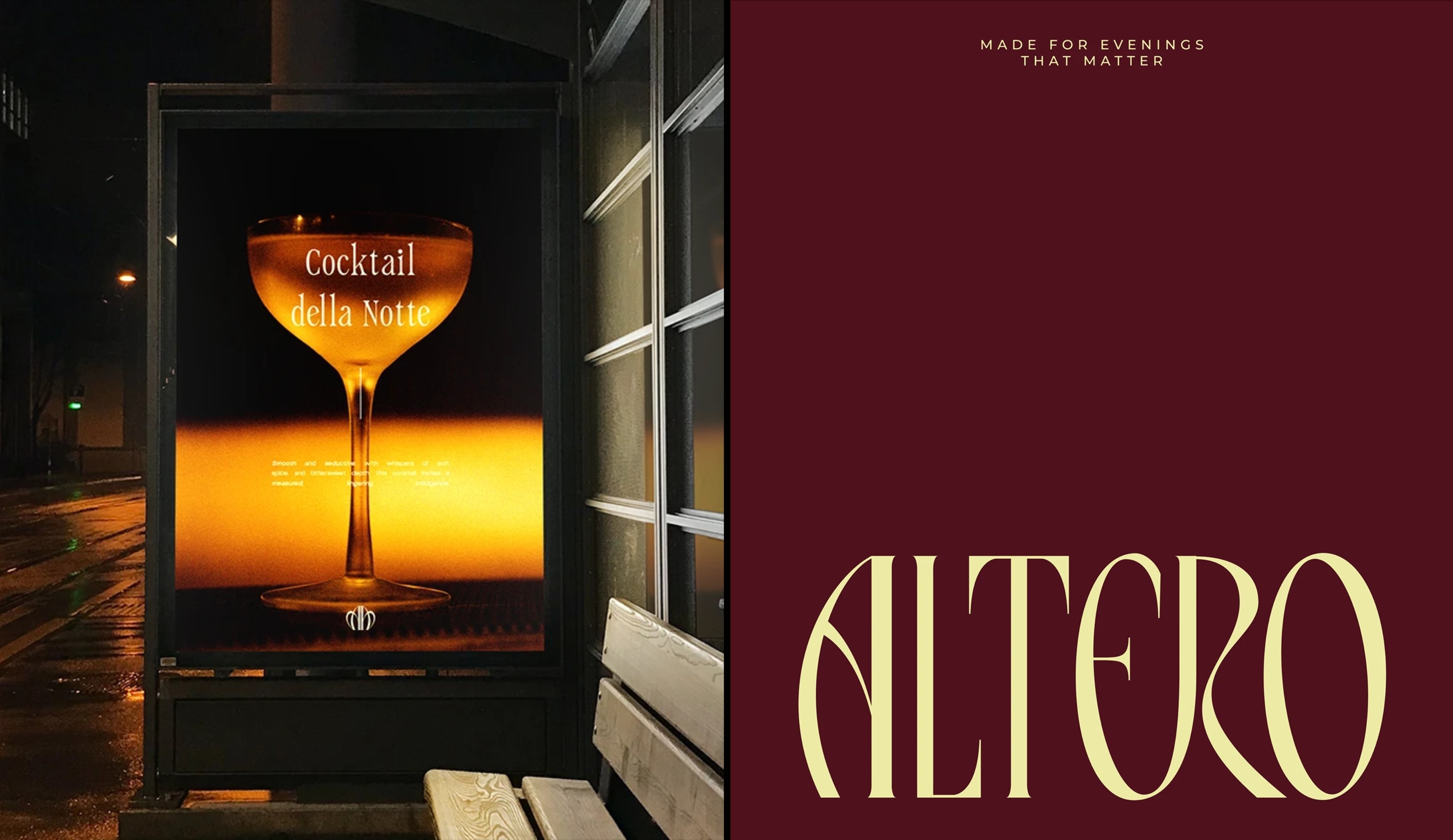
Altero needed a brand identity that could carry the weight of its philosophy without overstating it. The identity had to feel deliberate and elevated across every touchpoint, from the menu in a guest's hands to the presence it holds on a screen, without ever feeling loud. The challenge was to communicate luxury through what was held back rather than what was put forward.
THE CRAFT
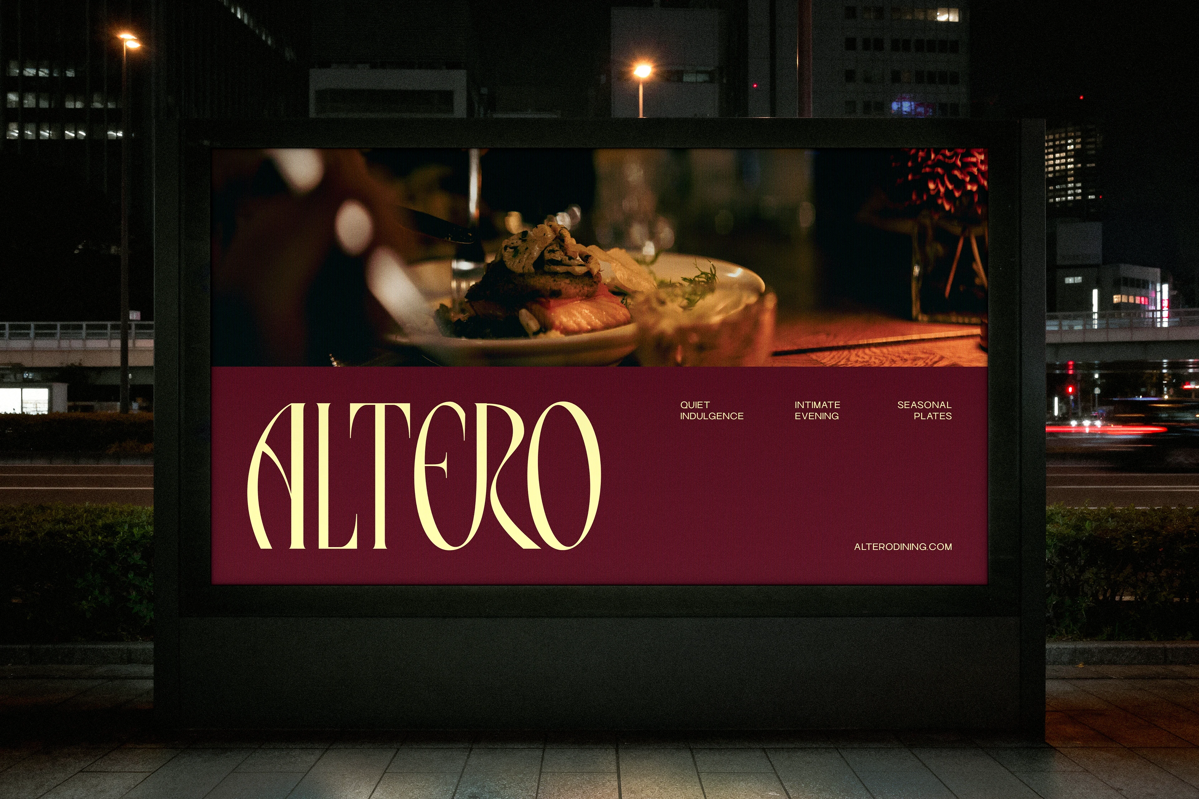
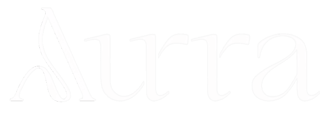
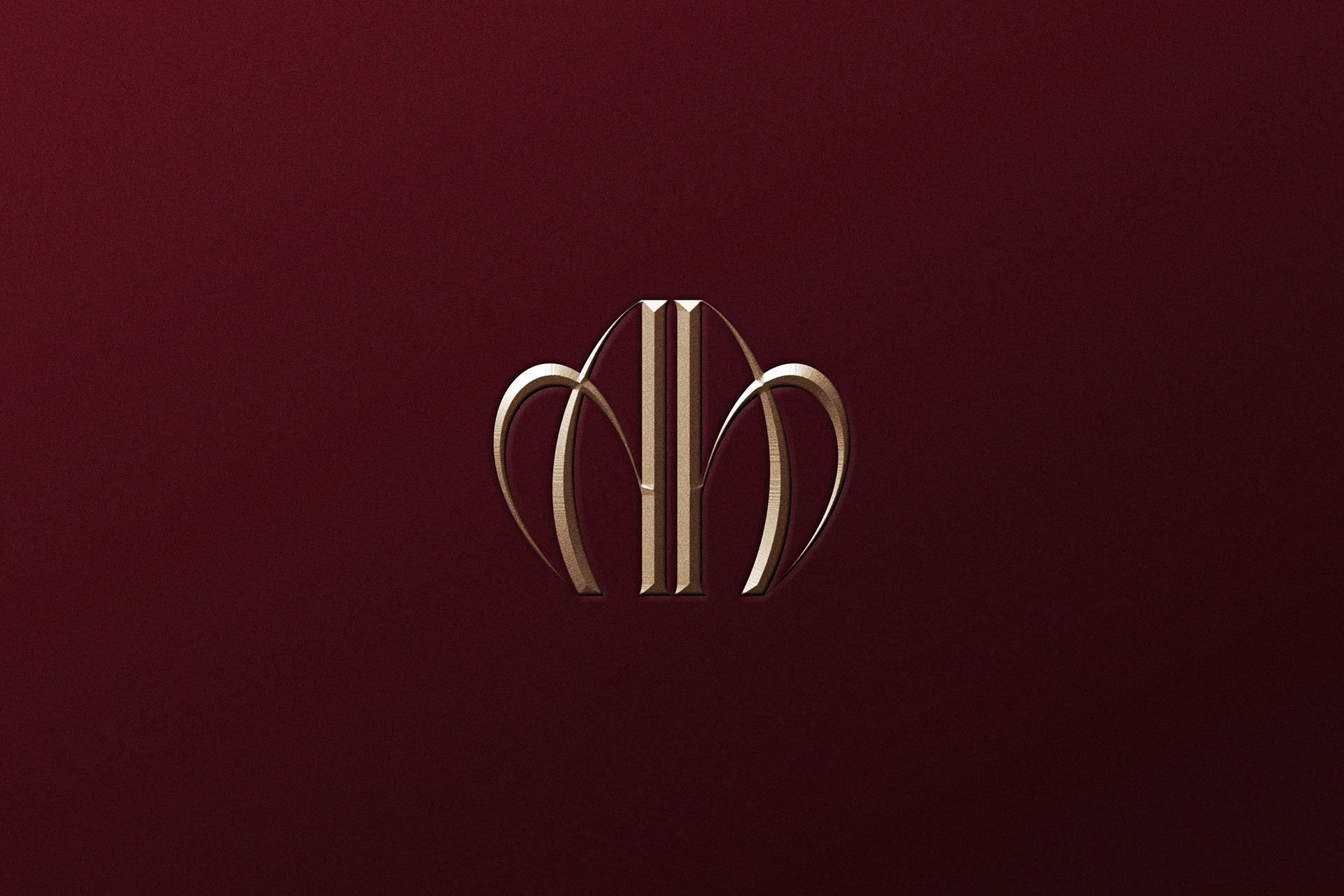
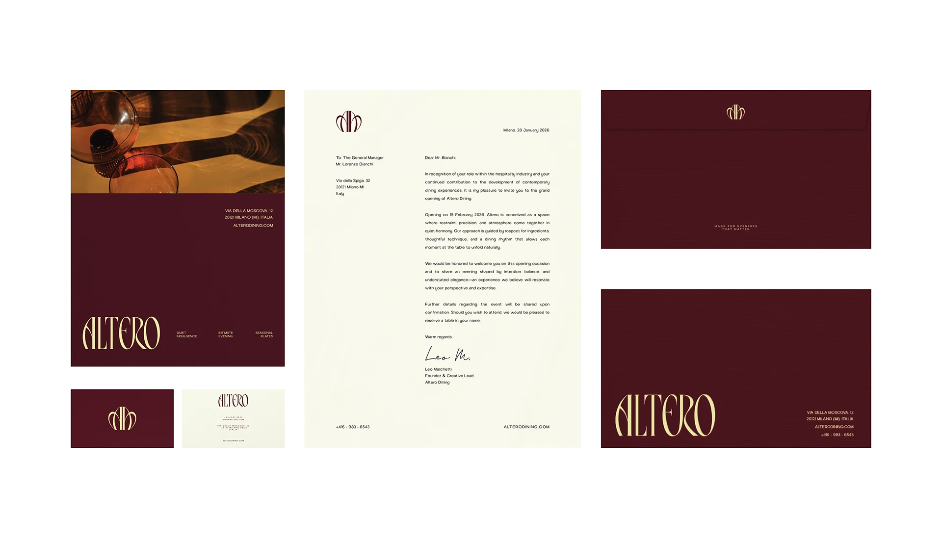
The identity was built around refined typography, deep tonal palettes, and considered details that elevate without excess. Every element was chosen to reinforce a single feeling: calm authority. The logo system uses elegant serif typography with a refined finish, sitting with the kind of stillness that does not compete for attention. The colour palette is deep and warm, creating an atmosphere of intimacy across both print and digital applications. Menu design, stationery, welcome cards, and social content were all approached with the same discipline, controlled composition, generous spacing, and minimal graphic intervention. The website and Instagram presence extend the same visual rhythm into digital, ensuring the brand feels equally considered whether encountered in the room or on a screen.
THE OUTCOME
The result is an identity where nothing feels accidental and nothing overstays its welcome. Altero's brand lives in the details, in the weight of the menu, the softness of the type, the silence between visual elements. A brand that does not ask to be admired, but creates the kind of atmosphere where admiration is inevitable.